Making Digital Products Feel Effortless
Effortless products are built on clear decisions and careful details. Here is how thoughtful UI design removes friction and keeps people focused on their goals.




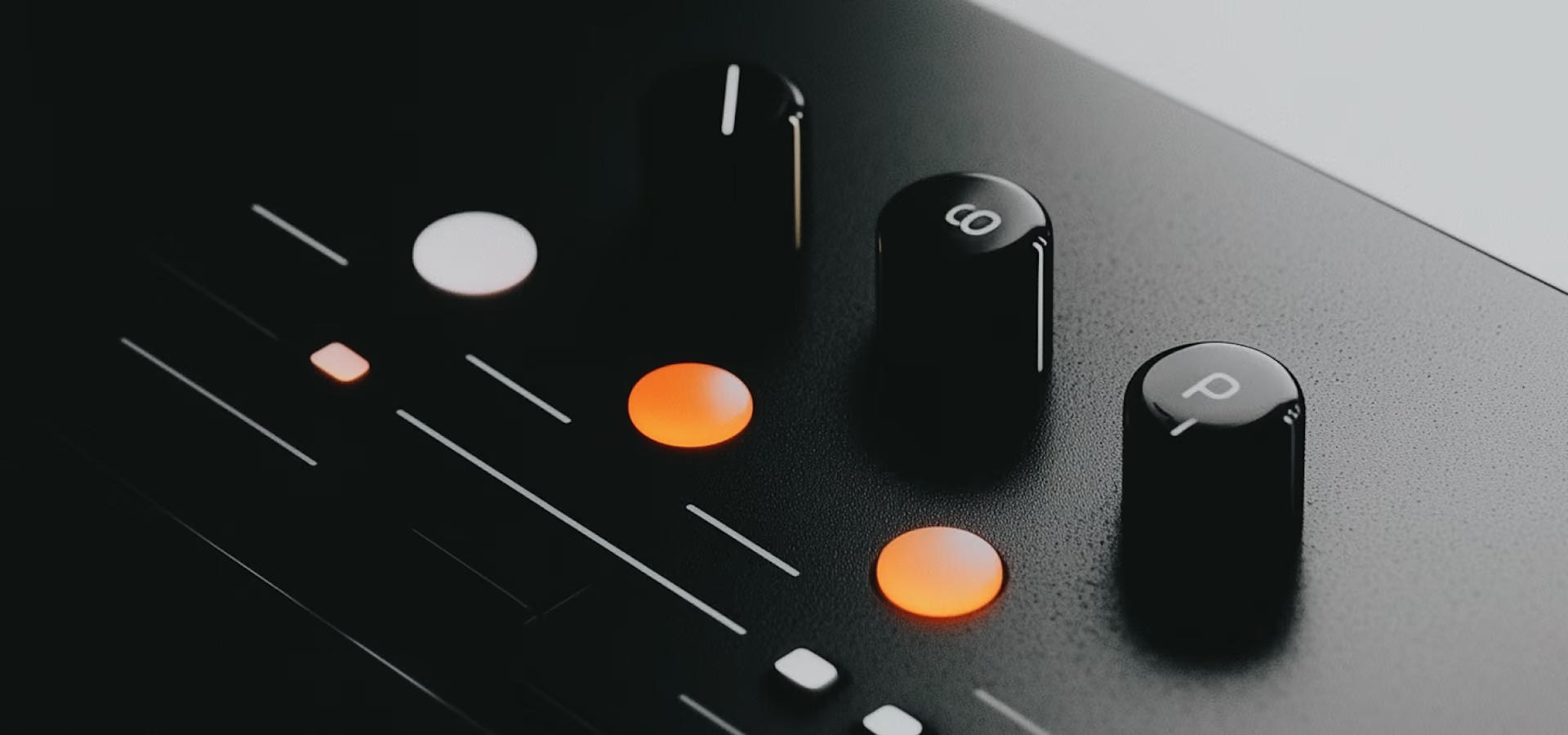
When a product feels easy, it is because someone made a hundred small decisions so the person using it would not have to. Effortless is the sum of friction removed one piece at a time.
People do not notice the decisions. They notice that they finished the task and did not have to think about the tool, which is the highest compliment an interface can receive.
The obvious friction is in the flows everyone tests: sign-up, checkout, onboarding. The friction that drives people away hides in the settings page, the empty states and the error nobody wrote copy for.
I keep a list of every moment in a product where a person has to stop and work something out. Each item is either removed, explained or moved somewhere it will be expected.
The list never reaches zero, and that is fine. A product that feels effortless is one where the remaining effort is spent on things the person actually cares about.