Why Type Can Change Everything
The right typeface shapes how a brand feels and how easily people read it. Here is why type deserves as much attention as any other part of a design.




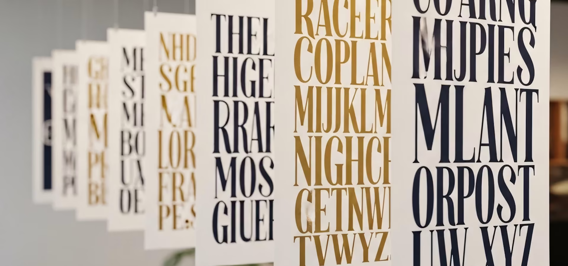
Before anyone reads a word, the typeface has already told them whether a brand is serious, warm, technical or playful. A font choice is a tone of voice, set in advance, on every page at once.
The brands people remember rarely use the most unusual typeface. They use a considered one, consistently, and let the words do the work. Consistency is what turns a font into a signature.
I start with the longest paragraph the product will ever show and set it in every candidate at real sizes. Faces that look striking in a specimen often fall apart in a dense settings page.
Then I check the numbers, the ampersand, the capitals in a heading and the lowercase in a button. A face has to work in all of those places, because a product uses all of them.

Only then do I look at personality. By that point the shortlist is short, and the choice is about which voice fits the brand rather than which face caught my eye.